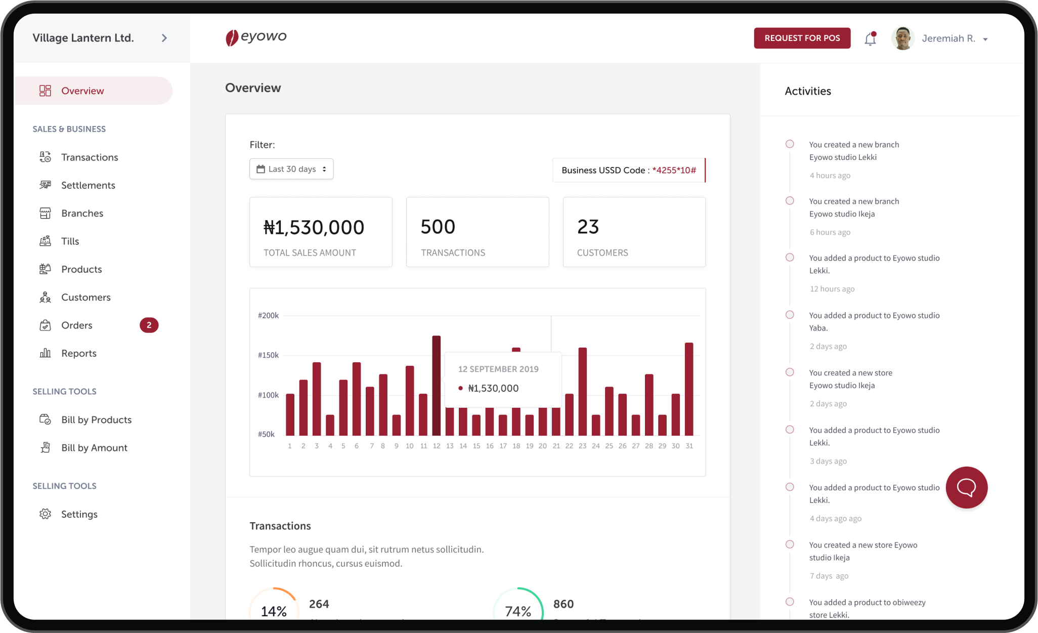
Helping retailers sell fast,sell more anywhere.

Scope
Design a new retail product (Kwiksell) end-to-end.
Platforms
Web, Mobile (Android & iOS)
Tools
Figma, Miro, Notion, Zoom, Dovetail, Airtable, Zeplin, and Jira.
My role
UX Research, Product Design (UX/UI), and Design System
Status
Live
Background
After launching for the very first time in October 2019, over 300 Nigerian businesses (retailers) have used Eyowo Retail (now Kwiksell) to sell and collect payments from customers. Kwiksell is the new retail tool designed to enable all kinds of merchants to sell fast, sell more, and grow their businesses from anywhere all-in-one place.
Since its inception, merchants and businesses have enjoyed using the product to sell, run and grow their businesses seamlessly. By the end of Q2 2020, we realized that the product’s use cases had evolved, and different industries were using it in ways we never catered for initially (e.g., a restaurant owner using the product to sell and run their business).
With many custom feature requests and numerous complaints from our users (merchants), it became apparent that the solution we initially launched was limited. It was clear that we needed to start a new effort to redesign the product & entire experience to serve our users better.
The problem
Based on user feedback, some of the issues that needed to be addressed which prompted a redesign were;
- Outdated look & Feel of the product.
- Usability & accessibility issues.
- Complex and Complicated app experience and a very steep learning curve.
- Scalability issues (not designed/optimized to accommodate new features and improvements).
- Complex user journeys and flows.
- Overall performance & stability issues.
Settlements was a major pain point and solving for instant settlements was critical for delivering great user experience for merchants
Discovery
We identified our priority industries and designed for them first while building for every other merchant who would eventually use the product. Although the previous product already worked well for general retail merchants, we needed to design a more inclusive solution to accommodate restaurants and fast food businesses.
We had to figure out a way to make the new designs very simple to use, easy to scale, have fewer learning curves, communicate trust, and at its core – make merchants sell faster and grow their businesses.
Research & Insights
We didn’t want to build on assumptions based on the problems we knew already, we were careful to consider a more inclusive user-centric approach.
So, the first thing we did was to understand all our user types and segments. We also had extensive conversations with all the key stakeholders to understand the business goals, align on the vision and manage expectations.
At the end of this exercise, we had a clearer understanding of our prioritized users, their pain points, and the problem actually needed to solve.
I collaborated with other designers and product managers to conduct user interviews with merchants across restaurant & fast food segments to deeply connect with them and understand their needs.
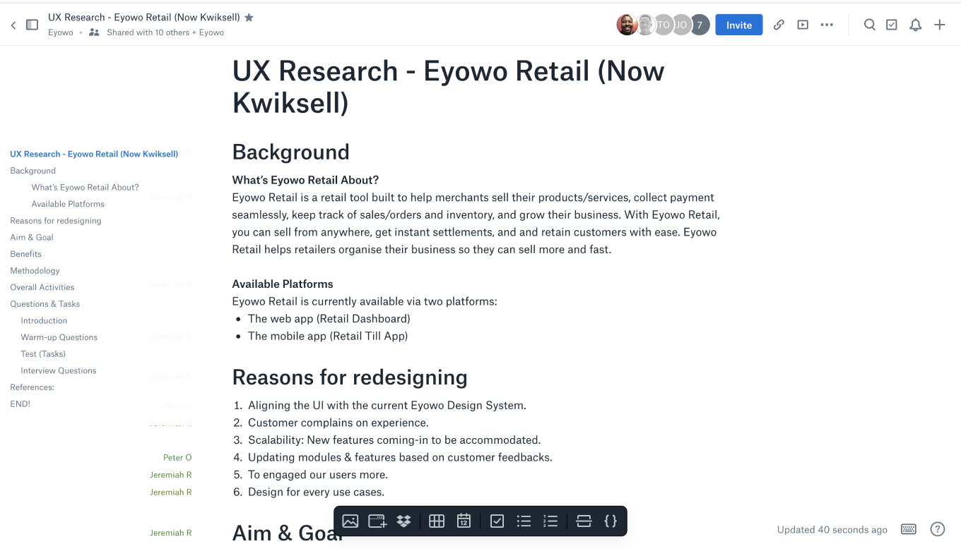
We organized all the feedback using card sorting and categorized responses according to good, bad, and what they would like to change or improve. Then all the responses were properly documented on airtable.
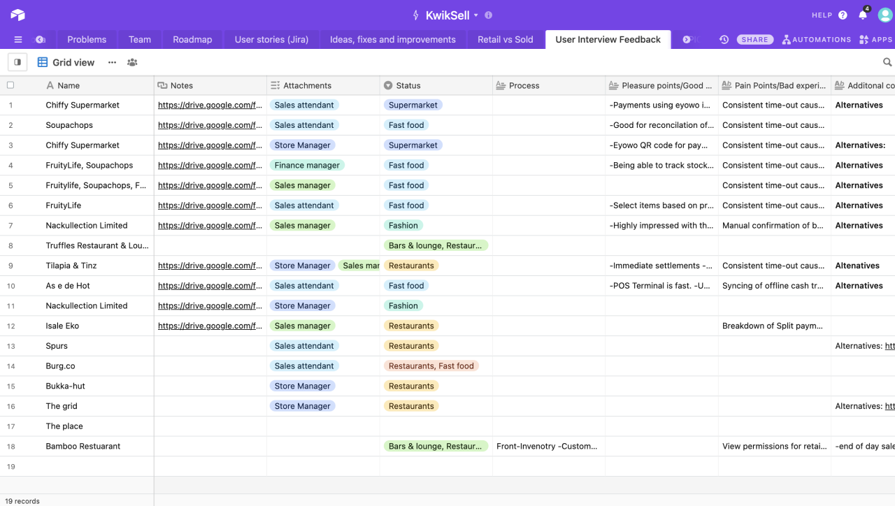
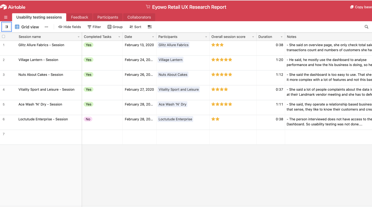
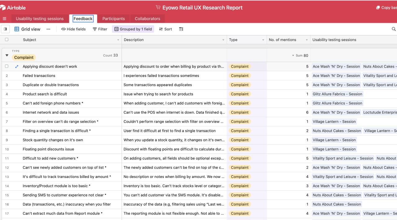
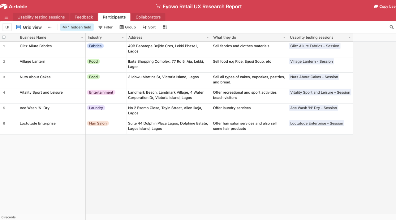
We prioritized the different problems we discovered using an Impact vs Effort Matrix. We also looked at a few competitors, they include but not limited to Square Retail, VendHQ, Loyverse, Ecwid, Shopify, and Paystack Shop.
Insights
We discovered a couple of problems and after synthesizing all our research findings, we identified key problems we needed to solve.
Personalization – Attempting to design with a one size fits all approach didn’t deliver the much-needed personalized experience every merchant should have.
Speed and Inefficiency – The entire process of selling wasn’t happening fast enough and we needed to find a way of optimizing the user flows and designing a seamless selling experience that delivers on the promise of selling fast.
Reporting – It was important to design reports in such a way that it is easy for merchants to understand their finances and sales at one glance. We had to take away ambiguity and solve for simplicity.
Convenience – The first version of the product wasn’t usable across multiple devices and wasn’t the most convenient to use. Solving for convenience would mean that the product works seamlessly anywhere and on any device.
Ideation
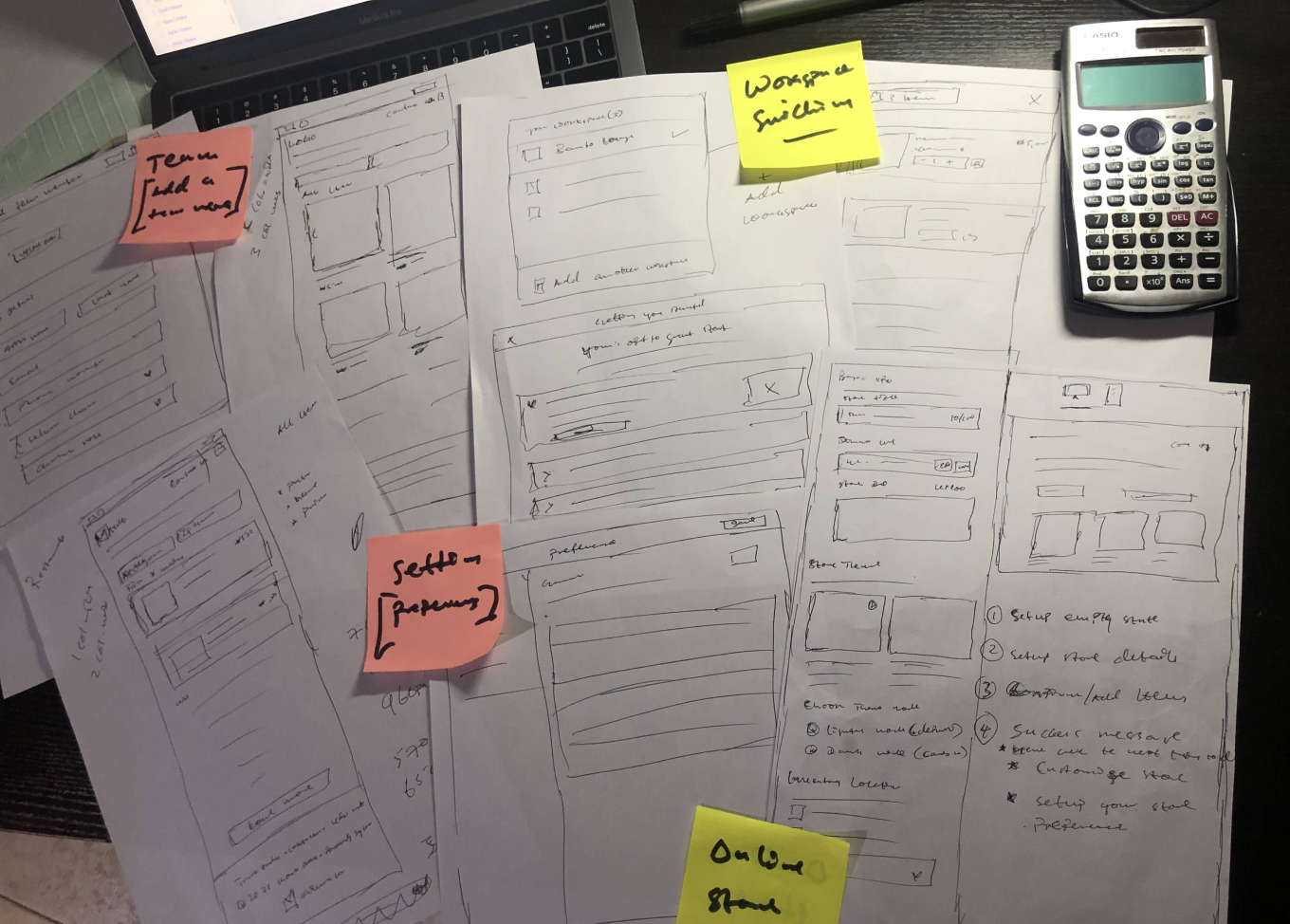
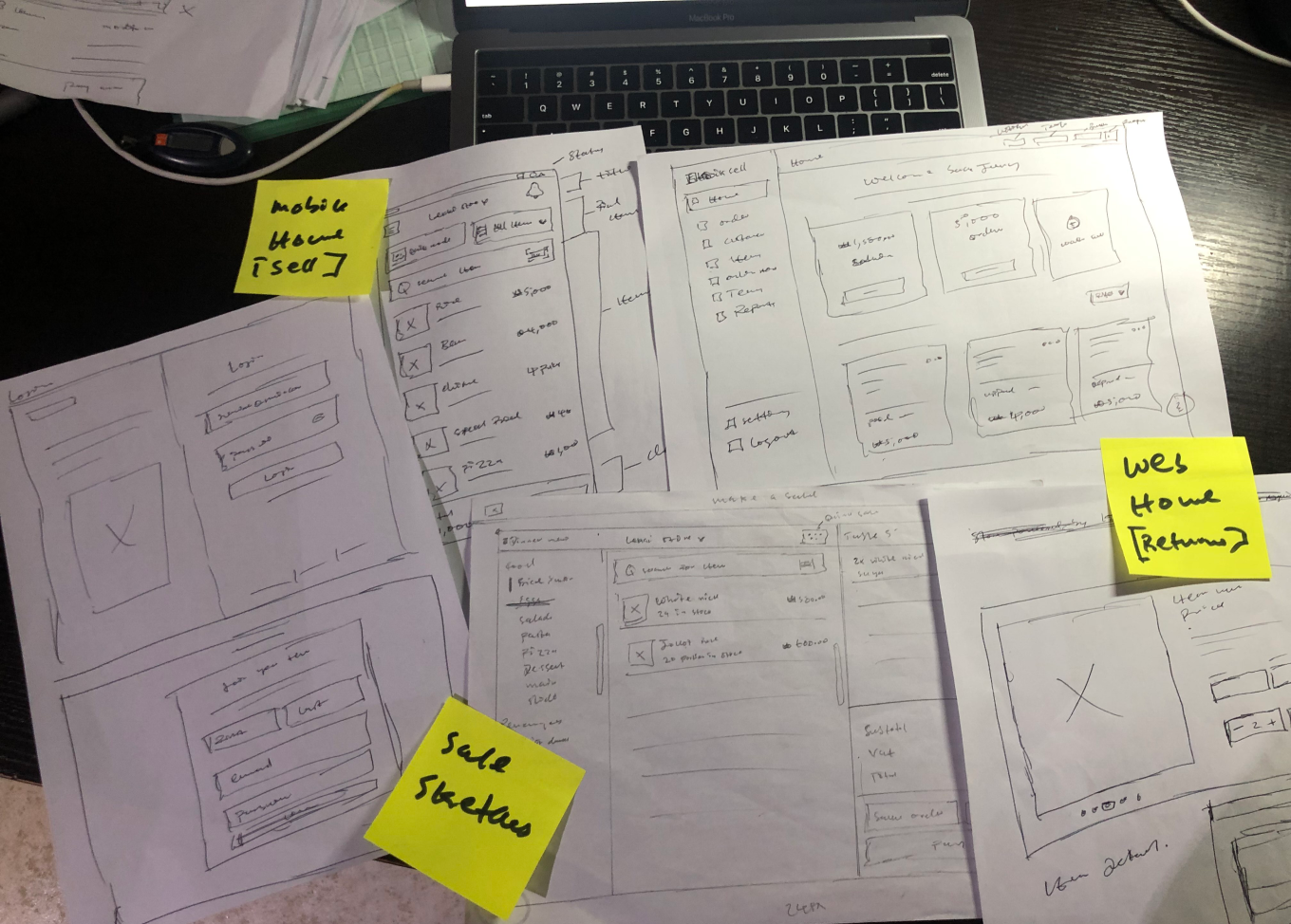
We started attempting to solve these problems we identified first by creating user flows and sketches which were then translated into high-fidelity prototypes that we validated with real users.
User flows & Information Architecture
In order to be sure we were solving the problem the right way, we created user flows and sketches to validate our approach to the problem.
Design System
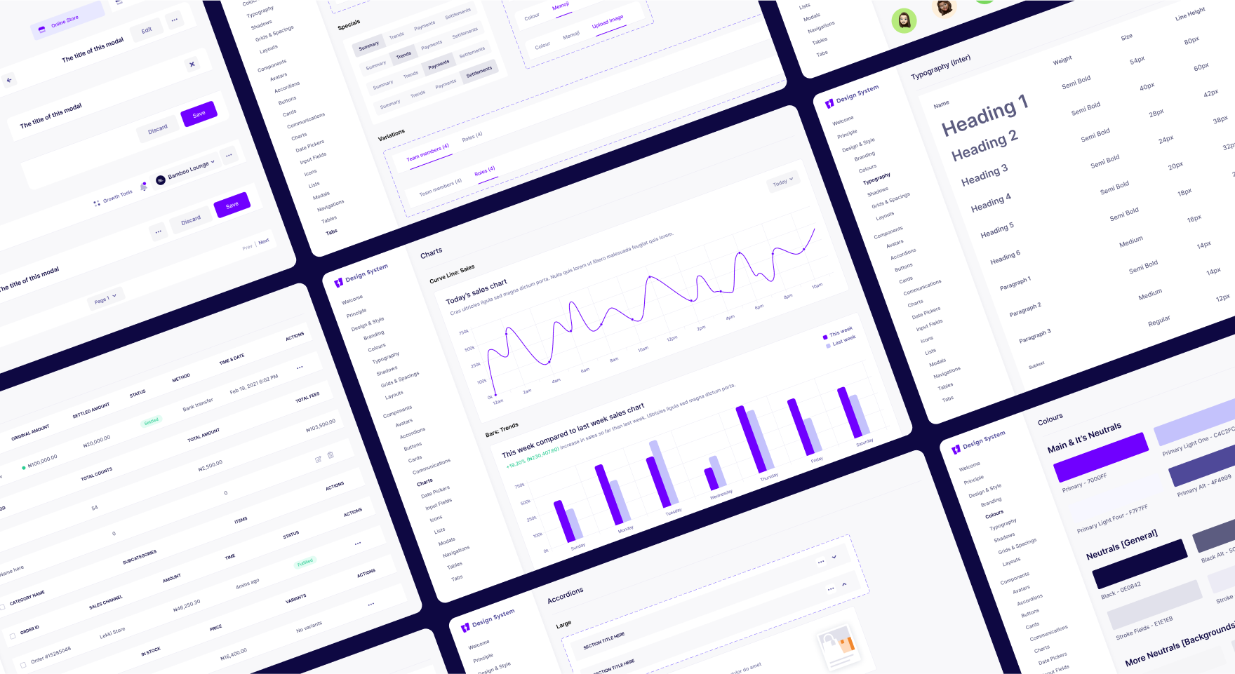
To design for scale and have a unified experience across the product, we created and standardized a component-based design system used across the entire product. It also ensured product consistency and sped up design and development time. It made it easy to iterate rapidly and collaborate extensively.
Onboarding
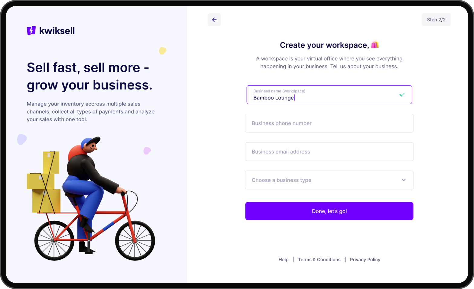
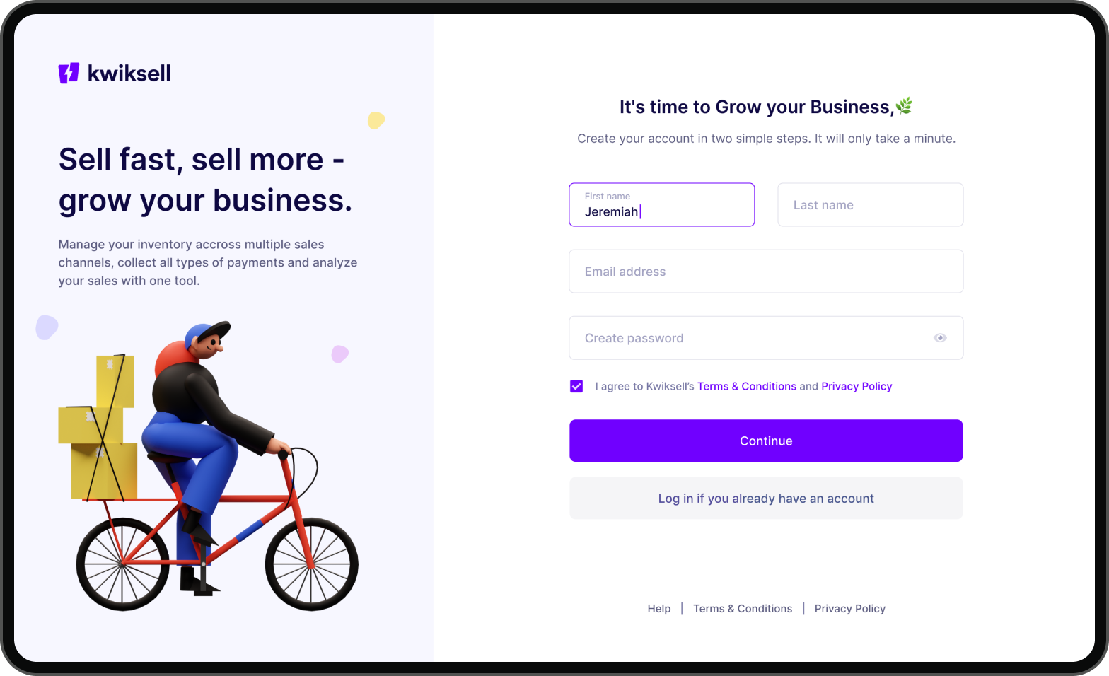
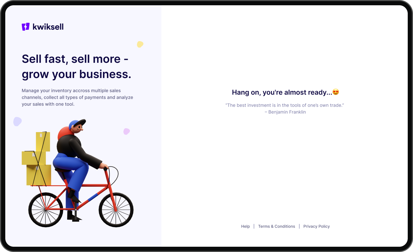
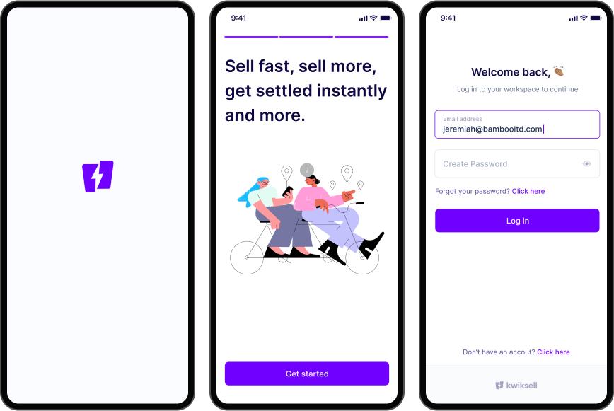
We thoughtfully designed the onboarding experience in such a way that it significantly shortens the user journey and enables merchants to onboard themselves It was important to be human in our communication.
Mobile (Android & iOS)
Designing for mobile was very important because it represented our promise of ease and convenience. We designed for Android and iOS to include as many users as possible.
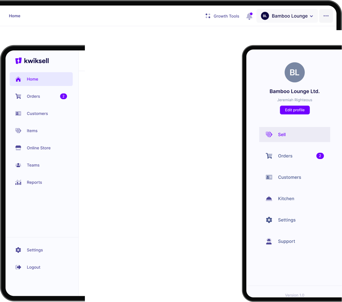
Navigation
We had to design the navigation to prioritize the most common actions and behaviors of the merchants. The user flows were optimized based on feedback from validation sessions with the customers.
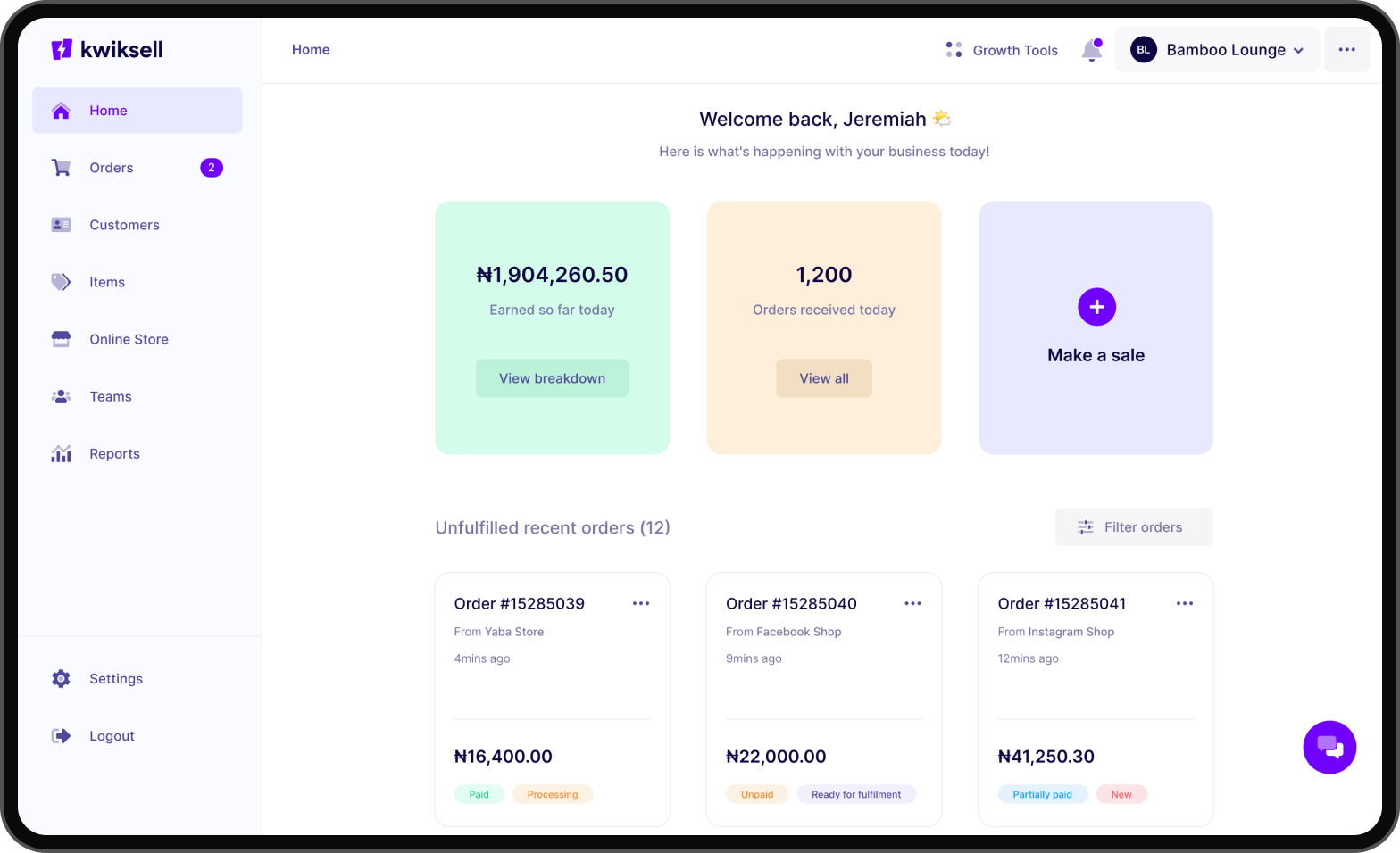
The Merchant Dashboard
We were intentional about the new dashboard experience design by avoiding going with the “report-like dashboard” or “graphs & charts” design style you will mostly find in today’s dashboards.
The goal was to make the home more functional, delightful, and simple. We achieved this by innovating around the features we’ve prioritized and the critical things merchants actually want to see/do (based on insight from research conducted) when they log in to the app.
Another cool thing we did was to tailor the home only to show the merchant what’s happening in their business for that day, e.g., earnings for that day (real-time) & orders so far for that day. Also, the most crucial action a merchant will take “make a sale” is made very prominent and easy to access. Fun fact – eight (8) different iterations of the home design was done before we arrived at this final one.
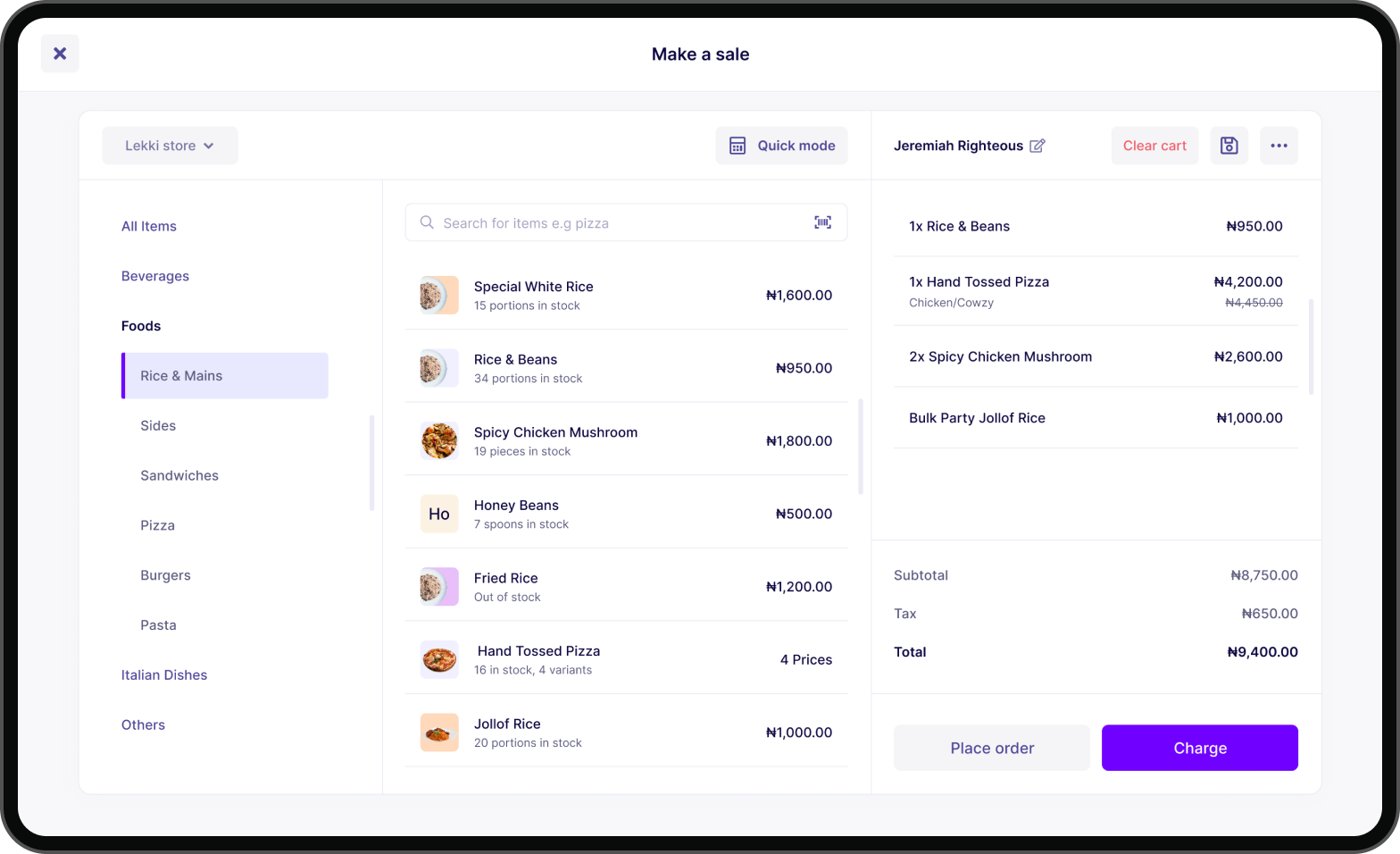
The Selling Experience
The new selling experience took a lot of time to design. One of the challenges was figuring out an intuitive approach to making the experience usable for both a restaurant (get value before charging) and other retail industries (that charge first before giving value) and making the design responsive on mobile. The merchant/attendants use the “make a sale” view to sell to customers (a customer can view the items and order amounts via a customer display device). The “make a sale” experience is available on the web and mobile apps.
Since we were also introducing subcategories, we designed the category browsing widget to make finding items easy if you’re not using the search (the easiest way to find an item to add to the cart). You have the standard cart on the right, and you can easily add and remove items before placing an order or charging the customer.
Our goal was to make this selling experience simple and intuitive. At the top left, merchants can also switch between sales channels they want to sell from (if they have multiple sales channels). You can sell via the quick mode (without having an item/product to sell). This is convenient for service-based businesses. Merchants can do many other things, like adding customers to orders, clearing carts, saving orders, and many more cart options when you click the more icon.
Collecting Payments
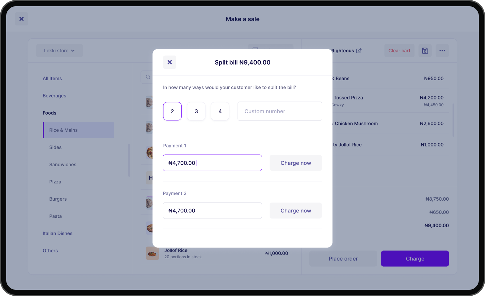
Collecting payments from customers when selling shouldn’t be difficult. We designed the charging experience to be easy for merchants. We support various payment methods and ways for merchants to charge their customers.
Reports
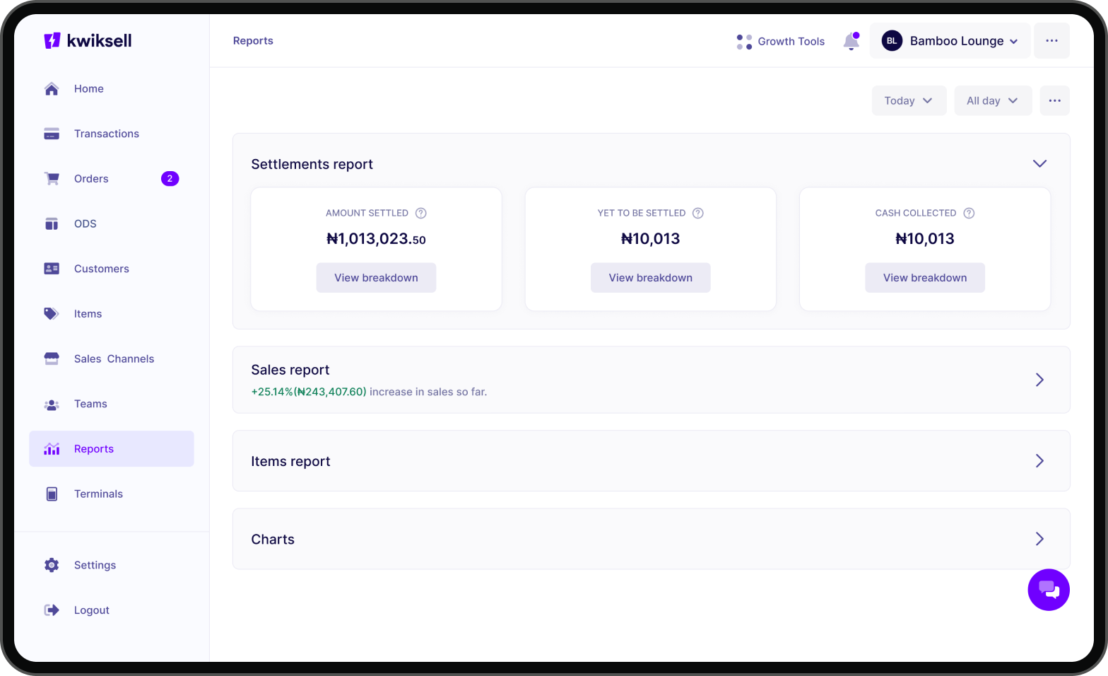
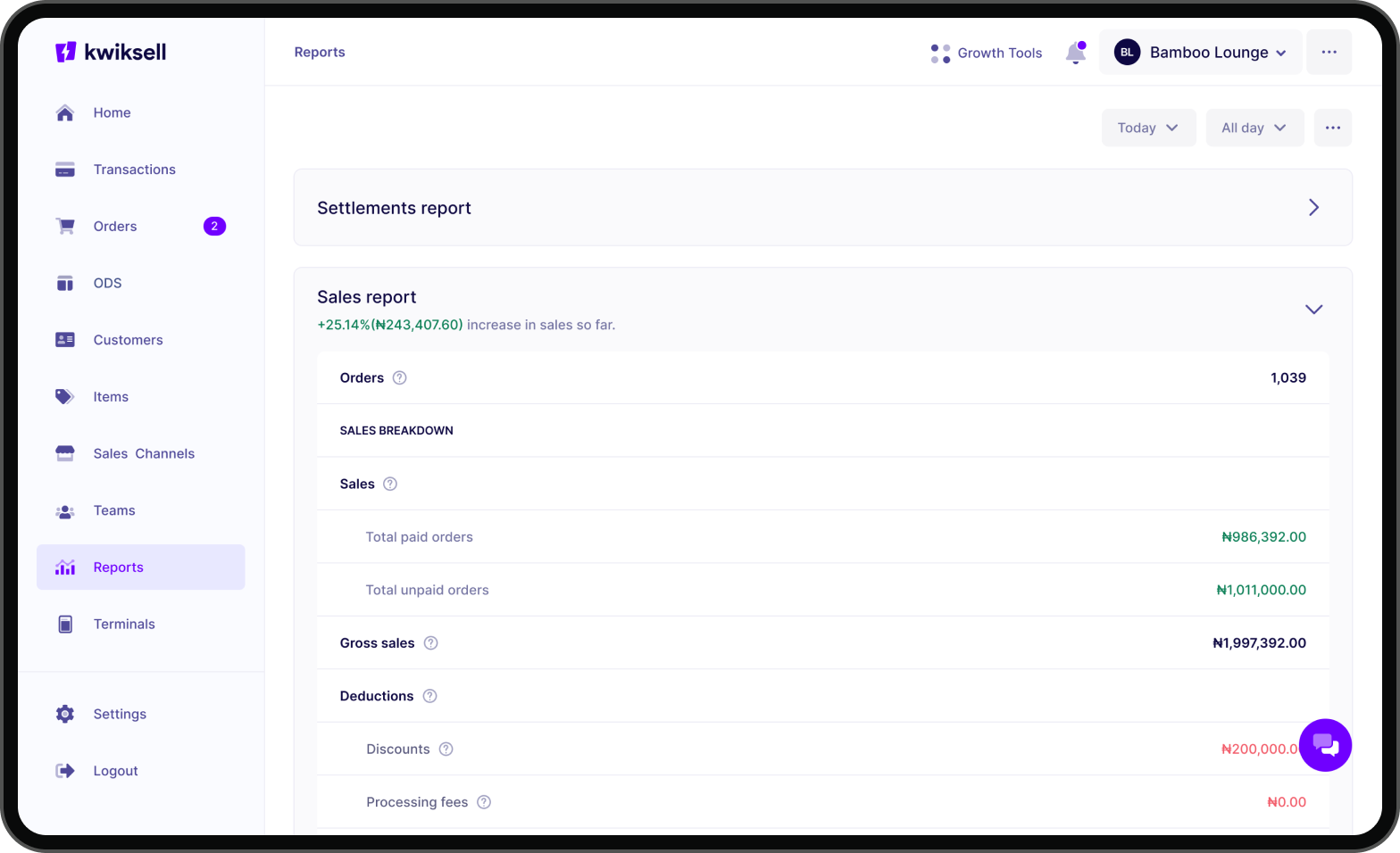
Reports had to be designed in such a way that it’s easy for users to understand their finances and business performance. I designed several iterations before we eventually arrived at that eureka moment when we knew we had solved the problem of complexity.
Inventory
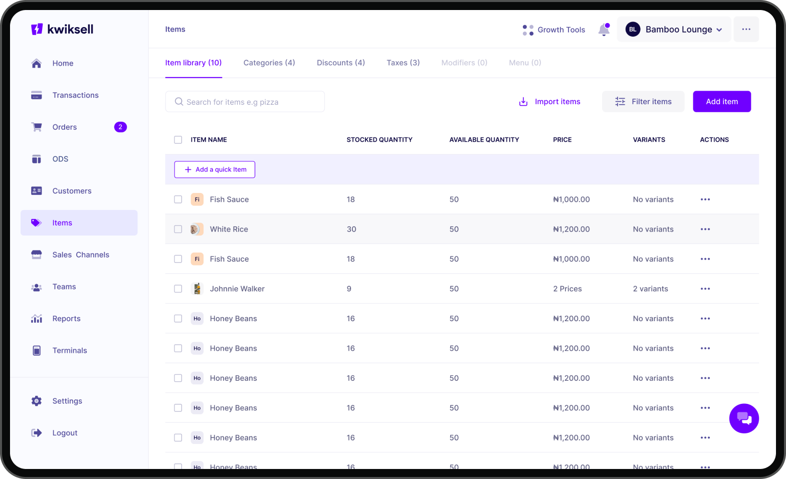
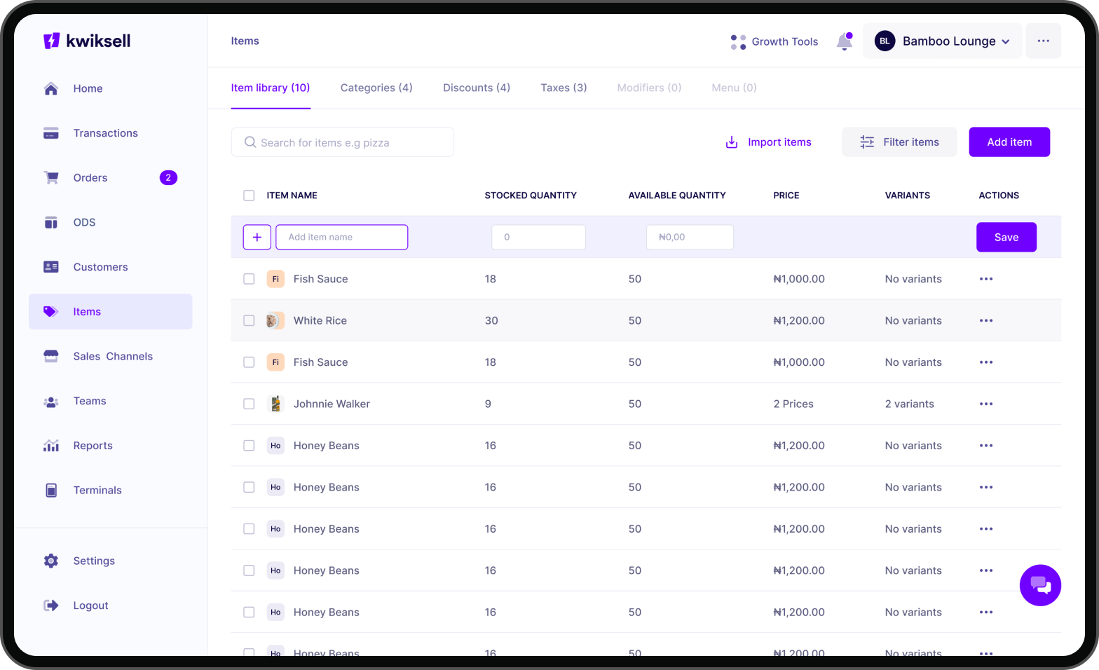
The items module (inventory) is one of the most critical modules on the app. After many iterations and validation sessions, one major insight we discovered was the fact that many restaurants are keen on speed and efficiency when tracking inventory and adding items. I designed “quick items” so that merchants can add an item as quickly as possible and start selling.
You can track your inventory, create categories and subcategories to organize your items/products, create discounts to add to items/orders at checkout, create taxes/vats to add to sales, and last but not least, create modifiers and menus (for restaurants).
The Items module supports many other features/actions for merchants, from adding items to updating them, viewing stock histories, copying checkout links of a product, multiple inventory locations management, variant items, composite items, etc.
Order Display System (ODS)
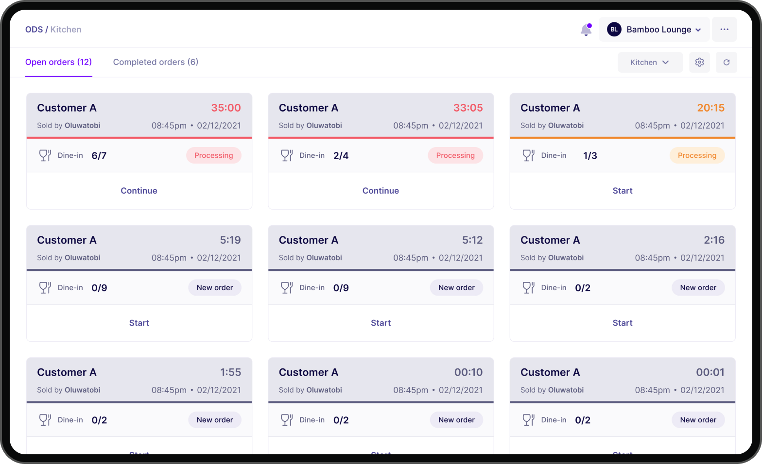
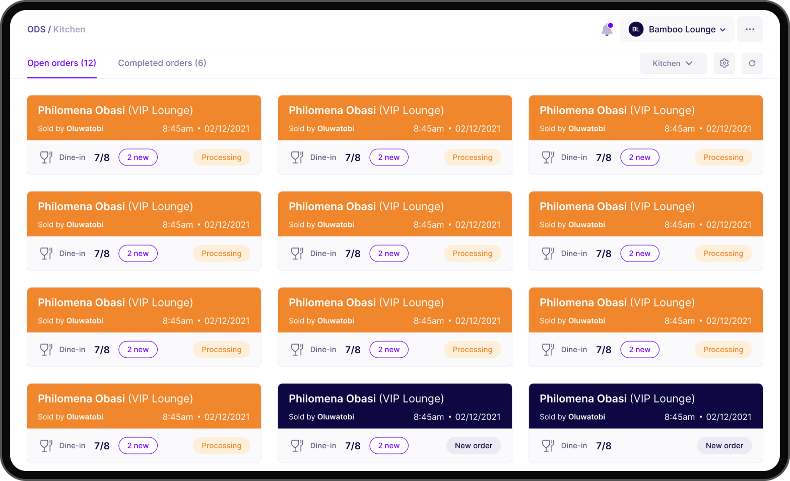
Designing the order display system required a lot of iterations because different restaurants and fast food businesses have different operational processes and unique needs. It was important for us to prioritize our solutions and sort based on which solutions would address the most important pain points users had. We eventually tested and tested until we arrived at a solution that fits well into all the different use cases.
With the ODS you can track orders based on categories. We also designed color codes to help distinguish each docket. When a docket is clicked, it automatically moves to processing and when the items are checked it automatically becomes a completed order.
Validation & User Testing
We validated individual modules and features with our users within diverse retail segments. I conducted several in-person interviews to validate our designs and receive first-hand feedback from the users themselves within their business environments. In validating the solutions, we had to make some adjustments to our designs based on new insights we gained from speaking with users again and again.
Our validations were in three major phases, we validated designs and prototypes, then we validated during development (Staging) and after production. It was important for us to learn and improve progressively.
Impact
Learnings
Frequent user testing: I realized that user testing should happen as often and extensively as possible. Most of the key insights we discovered were from subsequent user feedback and they contributed critically to the entire design and development process.
Align with stakeholders: I had to ensure that there was a very clear understanding of the goals of the business and align that very clearly with user needs. I had several meetings with business leaders, product managers, and developers to constantly keep our north star top of mind and stay on track with business and product goals.
Observe: It was very insightful spending time with our users and observing how they conduct their business. We visited restaurants simply to observe how their customers come in and how they are attended to. It also helped us to see the pain points that weren’t documented initially.
Ideate extensively: There were many iterations for different problems we had to solve and we always sought to explore as many ideas as possible and prototype very rapidly while being very mindful of the timelines.
Documentation: I missed out on some critical moments and information during the process because I didn’t document them quickly.
Key Collaborators
David Oyawoye (Brand), Habeeb Sanni (Design), Temidayo Oluwaniyi (Design), David Ogaga (Design), Jeremiah Righteous (Design), Raheemat Atata (Design), Ezekiel Adeyinka (Product), Ope Adeyemi (Product), Jadesola Akinnusoye (Product), Dilly Abia (Product)

