Making access to quality healthcare a reality through telemedicine
Scope
Redesign the entire app for both user categories (Doctors & Patients)
Platforms
Mobile
Tools
Figma, Miro, Notion, Zoom, Google Suite.
My role
UX Research, Product Design (UX/UI), and Design System
Status
Live
Background
The COVID-19 pandemic necessitated more innovative ways of accessing healthcare across Africa. The first version of Doktorconnect was released to immediately meet the growing demand for telemedicine in Nigeria. Within a few months, the company had acquired about 1,000 users however, product utilization and customer retention were below 30%.
The challenge was to redesign the entire user experience of the app to drive user engagement and to also increase retention. It was important to understand why users were not using the product and why the drop-off rate was low.
My design process
My approach to solving this challenge was to deeply understand users and discover vital insights about why they do not use the product and what their pain points are in order to discover ways to further improve the usefulness of the product in general. My approach was to speak with users and have in-person interviews as well as observational studies. I also spoke with key business stakeholders to ensure that there was a clear alignment with business goals and user needs. I advocated for the user at every step of the design process and ensured that user needs were top of mind.
It was a herculean task conducting interviews within the short timeline I had. Management wanted the product to launch in just a few months and it was a little difficult squeezing out time for research. I synthesized some of the data I got from the few respondents I could speak with and then I began to ideate, prototype, and test early iterations with users and stakeholders to ensure we were going in the right direction.
Understanding the user
My approach to solving this challenge was to deeply understand users and discover vital insights about why they do not use the product and what their pain points are in order to discover ways to further improve the usefulness of the product in general. My approach was to speak with users and have in-person interviews as well as observational studies. I also spoke with key business stakeholders to ensure that there was a clear alignment with business goals and user needs. I advocated for the user at every step of the design process and ensured that user needs were top of mind.
It was a herculean task conducting interviews within the short timeline I had. Management wanted the product to launch in just a few months and it was a little difficult squeezing out time for research. I synthesized some of the data I got from the few respondents I could speak with and then I began to ideate, prototype, and test early iterations with users and stakeholders to ensure we were going in the right direction.
Solving for Users
Style Guide
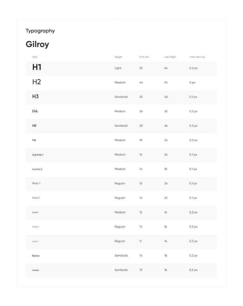
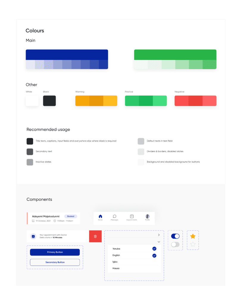
The home screen
It was critical to review the home screen and to make it seamless to access key features of the app.
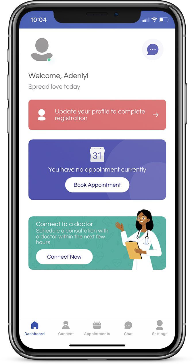
Old home screen
We tested the old design with users and one common feedback we received was that finding other features on the app was difficult. We discovered the need to improve the information architecture and prioritize the features in order to present them to the users first.
A lot of the user flows also needed rework, so I created new flows based on feedback in order to solve the problem.
Re-design
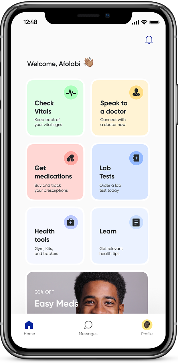
After exploring many iterations, we arrived at this iteration for the home screen. The new design categorizes all the features into cards. Each card mimics the rooms in a hospital and helps users navigate the app faster and better. I validated this idea with internal stakeholders and users.
Scheduling
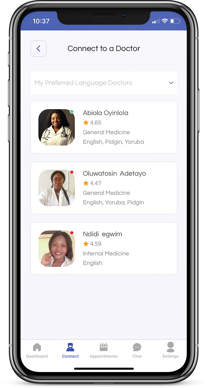
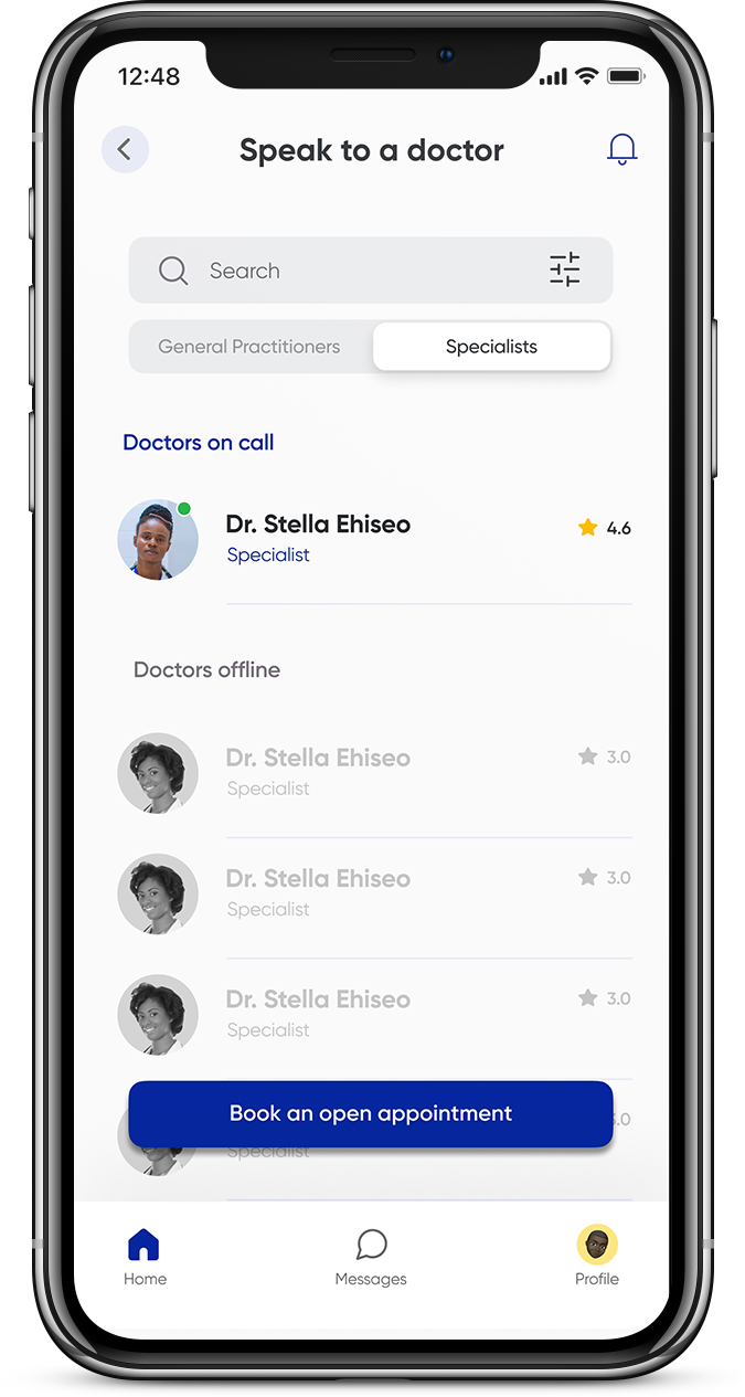
Many users had a hard time finding doctors on the app and they needed to know which doctors were online and those that weren’t online. We solved this problem by redesigning the entire scheduling flow for the app.
Scheduling an appointment
Users needed a better way to find doctors and streamline their search based on their current needs. It was important to solve multiple use cases and edge cases.
Re-design
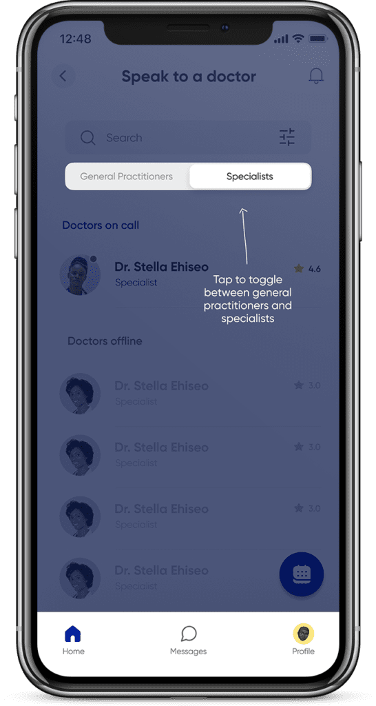
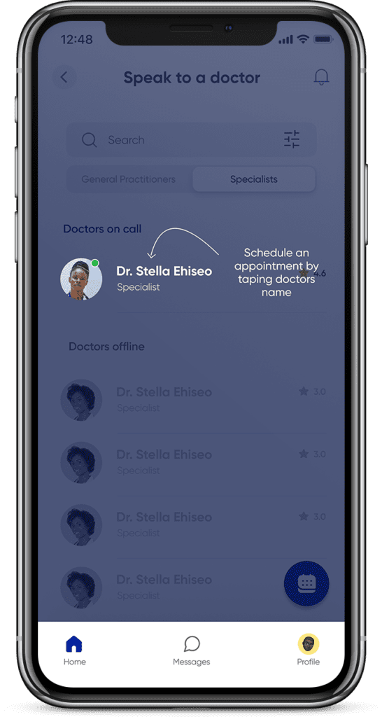
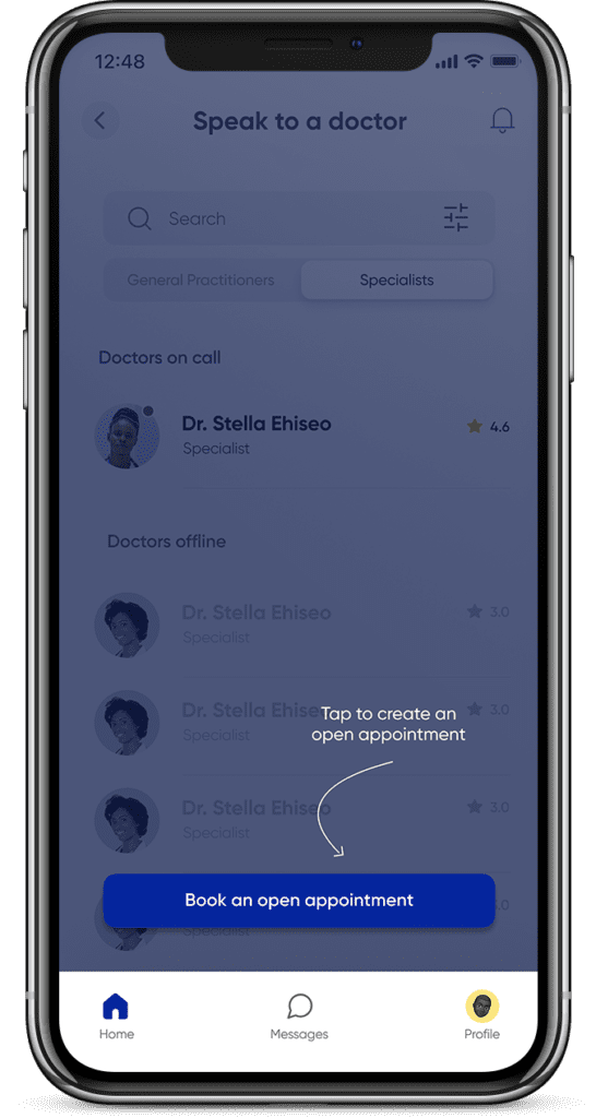
The new design allows users to switch from general practitioners to specialists seamlessly and to book appointments with them. It also shows doctors on-call and doctors offline. We also reviewed the UX copies for the screens and edited them to be human-centered.
Designing for secondary users (Doctors)
Many users had a hard time finding doctors on the app and they needed to know which doctors were online and those that weren’t online. We solved this problem by redesigning the entire scheduling flow for the app.
Creating schedules
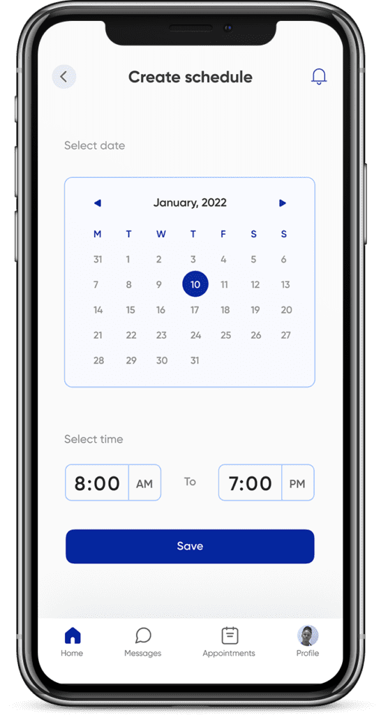
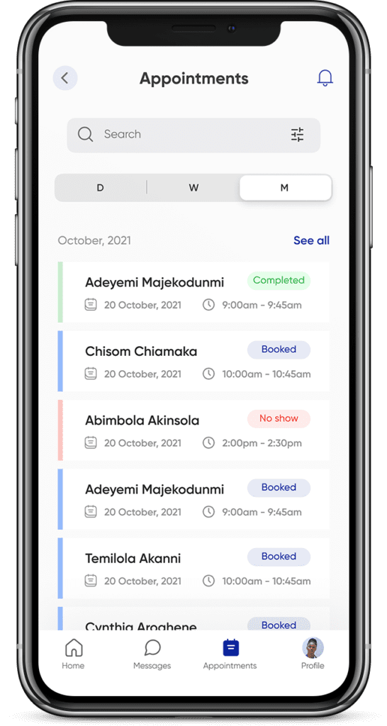
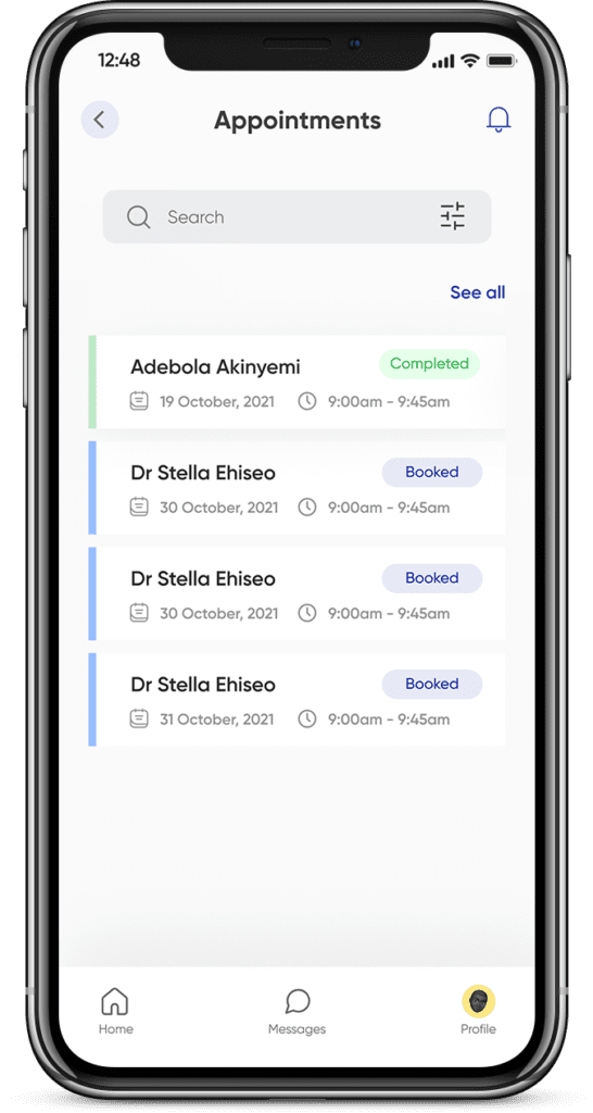
One of the major pain points discovered during research was that doctors had a hard time creating schedules and tracking appointments. To solve this problem, I designed a simple screen for doctors to create their schedules and an appointment screen with tags that help them track their appointments.
Product tours
During testing, we realized that new users knew exactly what to do when they saw the new interfaces. However, existing users were accustomed to the old flows and we considered product tours as a way to nudge behaviors and aid existing users and new users alike to navigate the app.
Reports
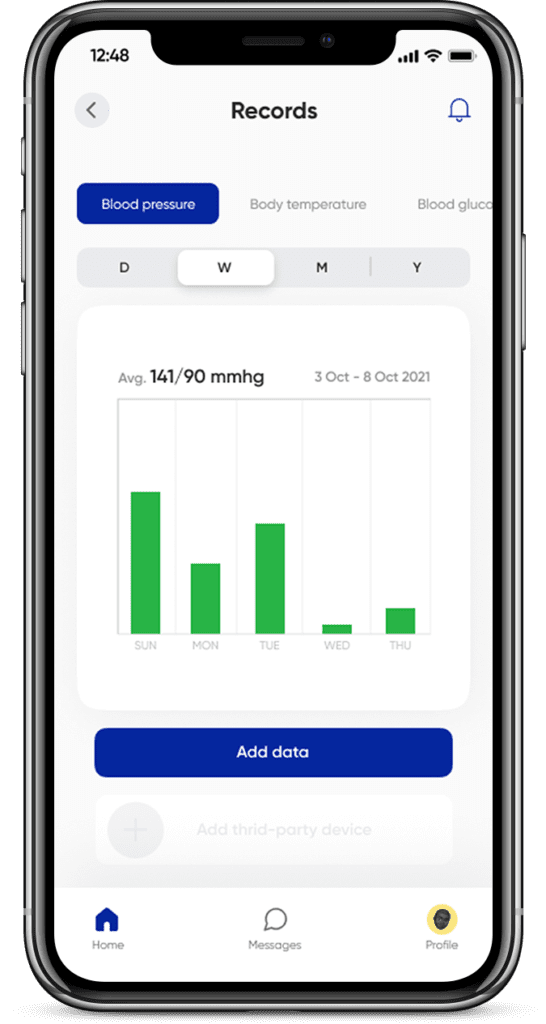
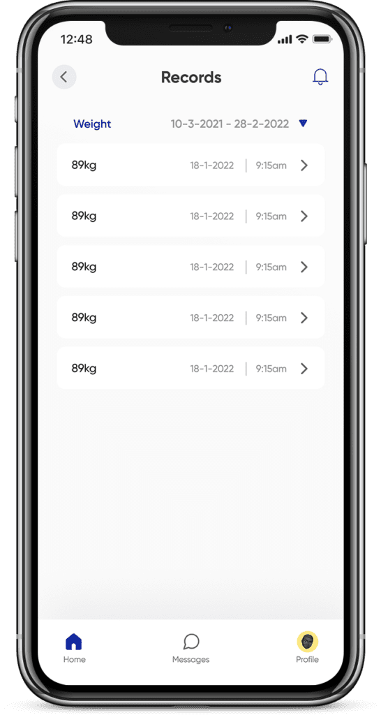
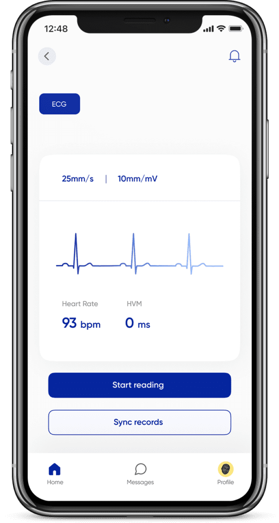
Reporting was another critical feature users found very difficult to use. We needed to create a simpler reporting experience for users to gain necessary insights into their health status and from there take action to speak with a doctor or get a prescription.
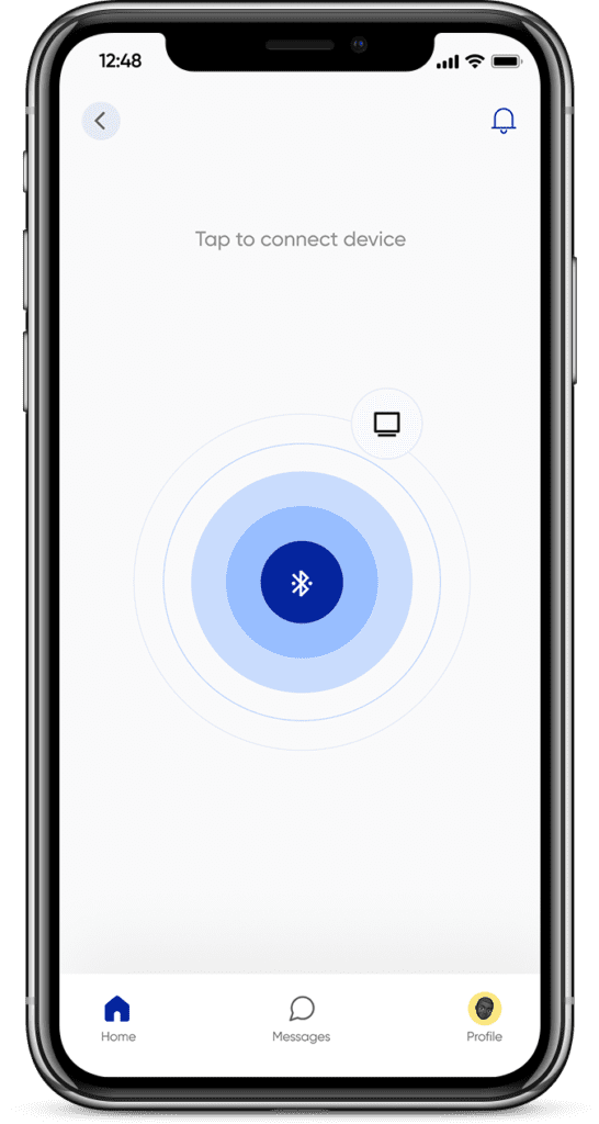
Other screens






Validation & Testing
After completing the high-fidelity prototypes, I validated my designs with key stakeholders and users to further verify that our design solution works. I did this by conducting usability testing within select focus groups of users. Some of the outcomes include about a 40% increase in customer acquisition and retention. The overall feedback from users has been that the app is now more delightful and simpler to use.
Conclusion & Learnings
Redesigning the Doktorconnect app was very interesting for me, particularly because of how robust the app is and how each module had to be simple and interconnected. I learned that testing early iterations with users and stakeholders saves a lot of iteration time and helps to arrive at the most viable solution early.
After testing my solution with users, the average time-to-value was shortened by 50% and overall feedback on the user experience was remarkably positive. However, timelines were stretched a little because the development process wasn’t really agile. I had some pushback from the developers because they wanted to ship quickly and didn’t want to implement any features that would take time to complete. We eventually decided to simplify some of the features to accommodate just the essential features in the roadmap.
